Yomo Bank
IN A NUTSHELL
MY PART
- Mobile-only bank of Sparkassen
- Creating an entirely new product from scratch
- Unique design and user experience
- Platforms: iOS and Android
- Target audience: Generation Z
MY PART
- Design lead
- Initial pitch presentation
- Setting up UX processes
- Regular user tests
- UX / UI Design
- Art Direction
Briefing
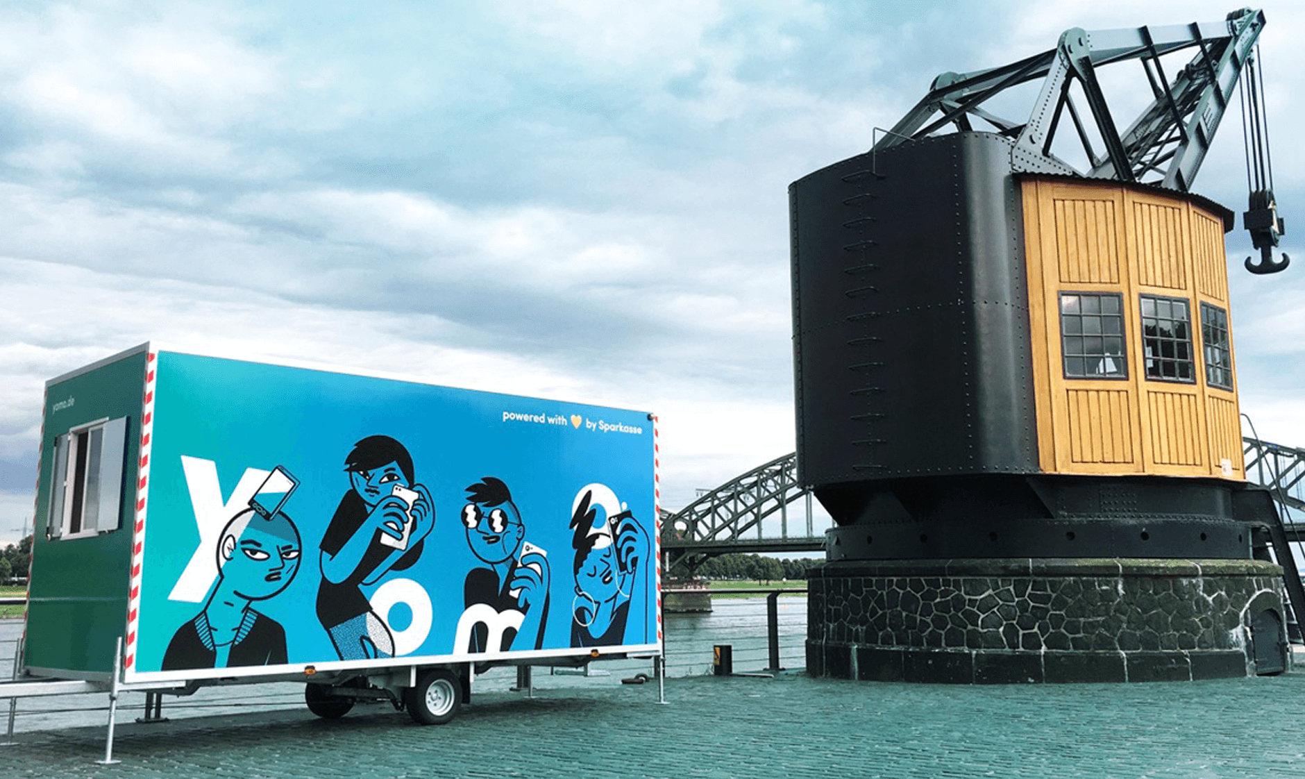
Community
The user-centric approach started with market segmentation. Yomo was to become THE bank for Generation Z. To gather young people's expectations of the new product, we organized events in eight major German cities, where we exchanged ideas with the target audience over beer and snacks.
![]()
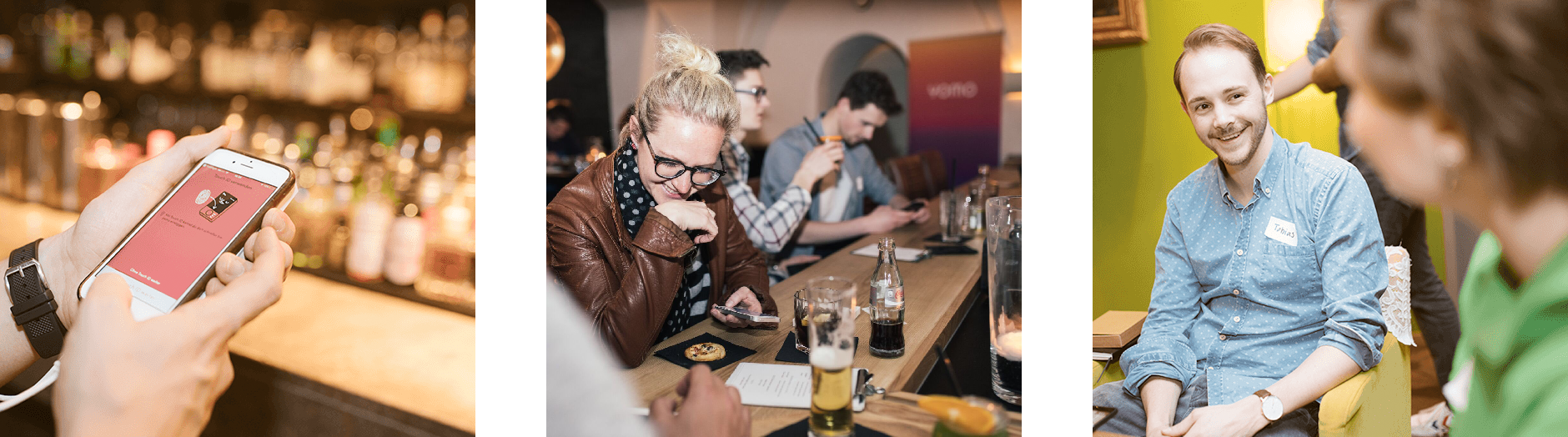
The people were constantly checking out new software builds and bringing us insights from other fintech products.

Personas

Interface
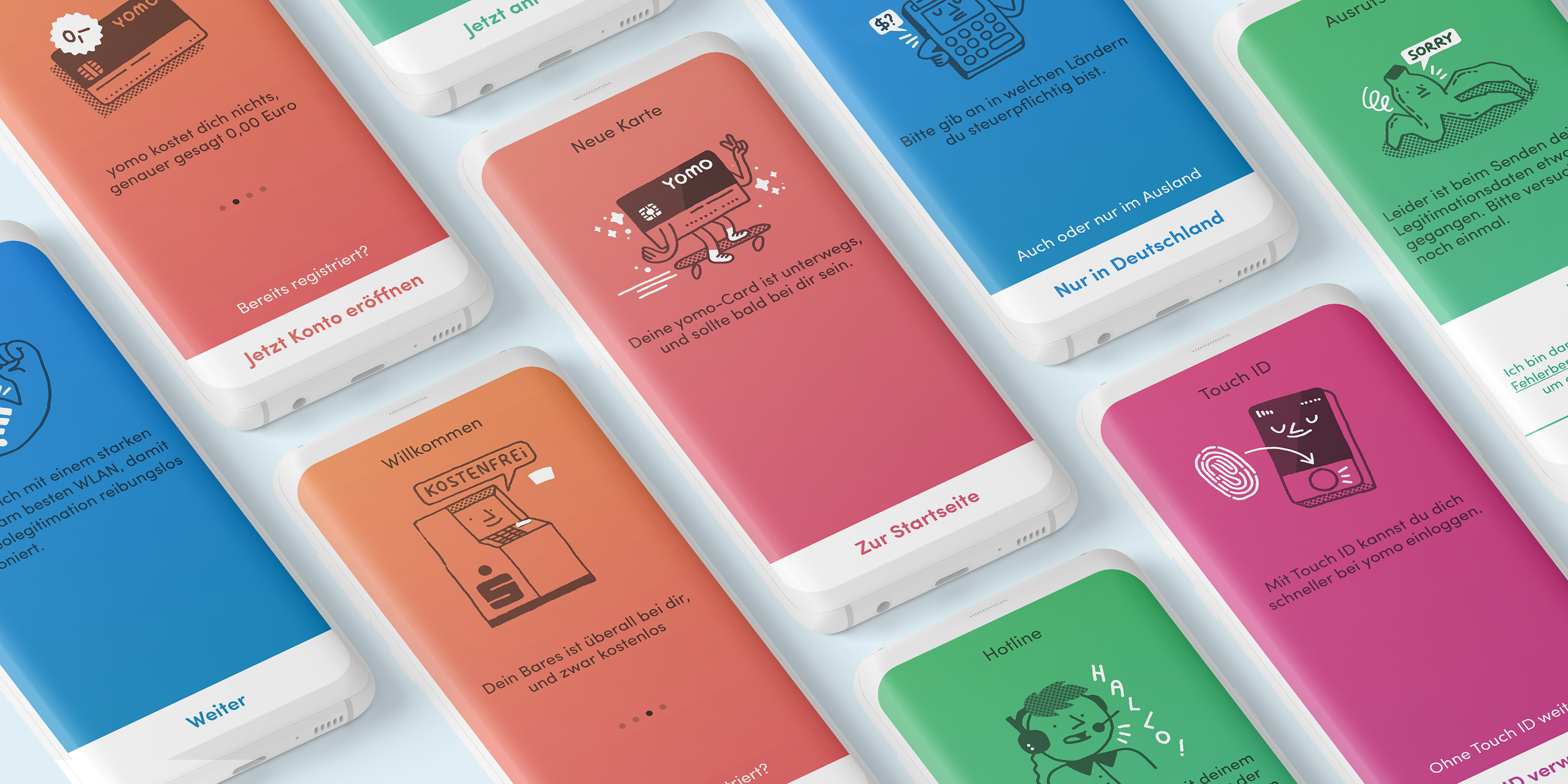
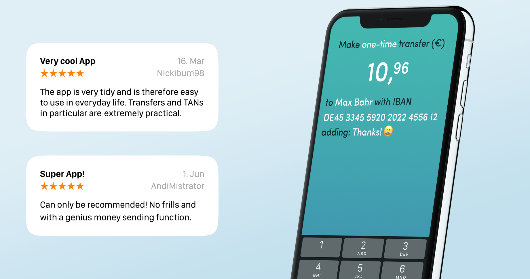
We were also consistent and left the established UI patterns if it made our users more efficient. The money-transfer-dialogue is a good example of the unique UX at yomo:

- Editable fields are tinted white
- Naturally spoken sentences instead of form fields.
- The most important information is set as a title.
- No banking vocabulary
The function was highly praised by the users:
Another unique UI pattern is the "breadcrumb cloud". During registration, all entries remain visible until the last step. The user can correct them by simply tapping them.
Colors

Illustrations
My highlight of the app is the illustrations that a great visual artist Guillaume Kashima created for us. Thanks to his witty sketches, complex and dry content is conveyed entertainingly.
