
Sparkassen App
IN A NUTSHELL
- Redesign of the most widely used banking app in Germany
- 4 Mio users
- A Complete redesign of the navigation and core features
- User tests in every cycle of concept/design iteration
- Platforms: iOS and Android
MY PART
- Ideation
-
Expert review
-
Concepts
-
Product design
-
Evaluation of the user interviews
-
Lo-fi and hi-fi wireframes
- Prototyping
- Visual Design
Briefing

In 2016, decision was made to modernize the app and adapt it more to the users' needs. The essential functions should be more easily accessible. Also, the outdated design should be modernized.
Design-wise, the primary warning red – the main corporate identity color – is difficult to work with:
- Red means an error in the UI context.
- It is widely used to signal negative balance.
The app should be modernized carefully. As our first user interviews showed, the app's appearance is generally perceived as matching the brand:


During the user interviews, we found out the most important triggers to start the app:
-
Has something happened since the last time?
-
Waiting for the salary to arrive.
-
Waiting for another payment.
-
Information about an expected direct debit that has taken place.
-
Information about an unexpected debit.
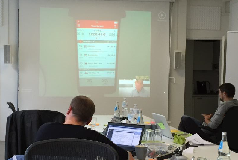
In-App Analytics essentially reflected the findings from the in-depth interviews; the average session duration is 30 seconds and is limited to the account and the transaction list in most cases (92%).
Start Screen

The main innovation in the app was an intro screen. It had several obvious and unobtrusive advantages. It was tidier and moved the most important functions to the front. (Ex: only a few subjects knew about the card lock function in the app).
Navigation
In the new app, switching between accounts is done by swiping left or right. Back navigation was no longer necessary.
This solution has another advantage: the main menu at the top left is now also accessible from the transaction lists.
The new navigation was intuitively understood by the test subjects from the existing customer base and was perceived extremely positively as a clear advance over the old version.
Transactions
The sales list has been polished, especially visually. Because most users access the app at least twice a week, they are only interested in the transactions of 2-3 days – about 6-8 list items.
So there was no need to have so many transactions visible on the screen. We increased the spacing between the items and generally enlarged the amount of white space. Since the savings bank accounts are kept in euro currency, the superfluous currency information on turnovers has disappeared. The cent amounts, which are less relevant for users, have been superscripted. The often-cryptic usage text can now only be found under details. These measures make the content easier to read and easier to scan.
Money Transfer
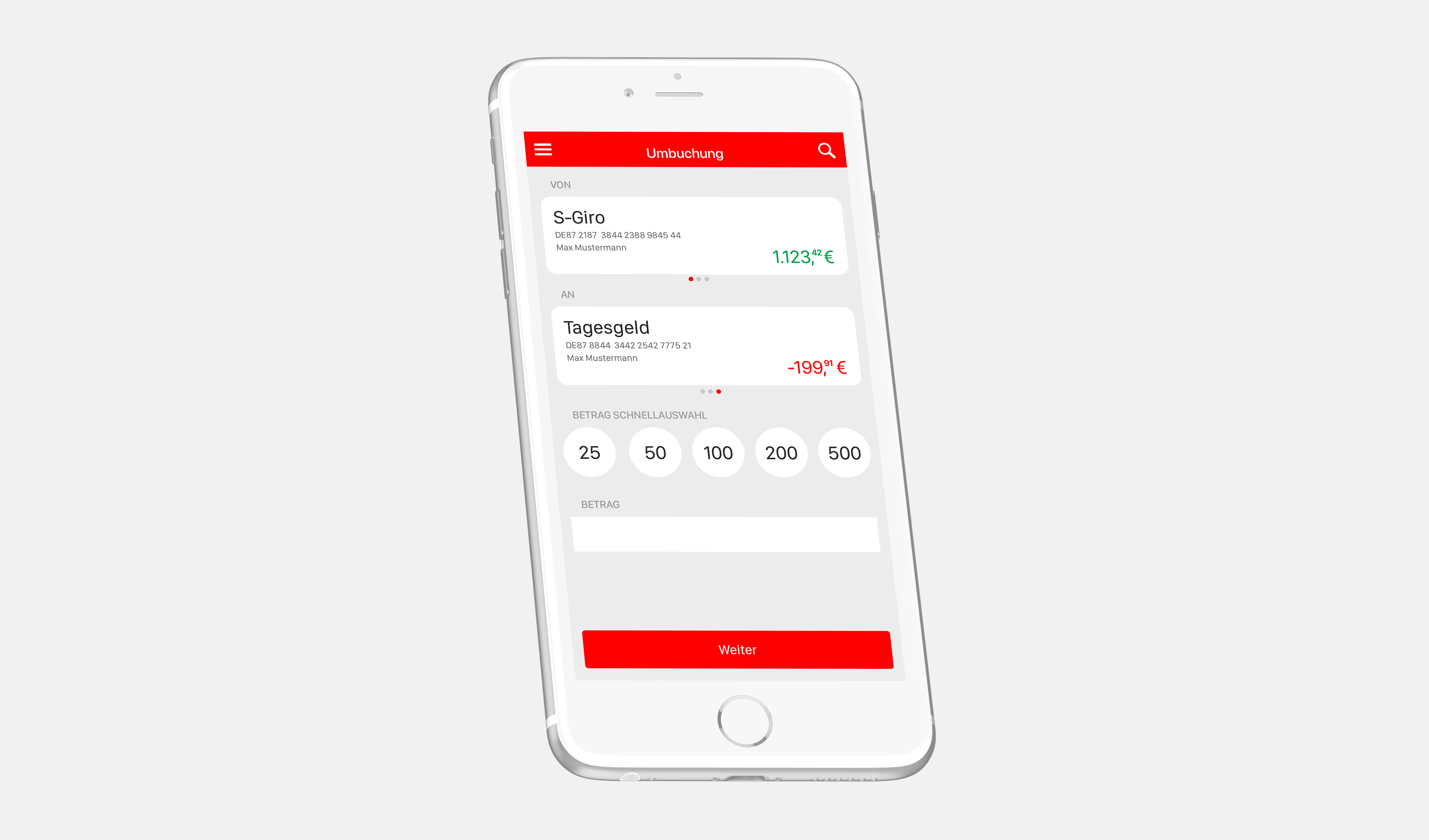
Compared to the legacy app, the prototype of the new app was rated by most of the test participants as clearer and visually more appealing, with a more modern design.

